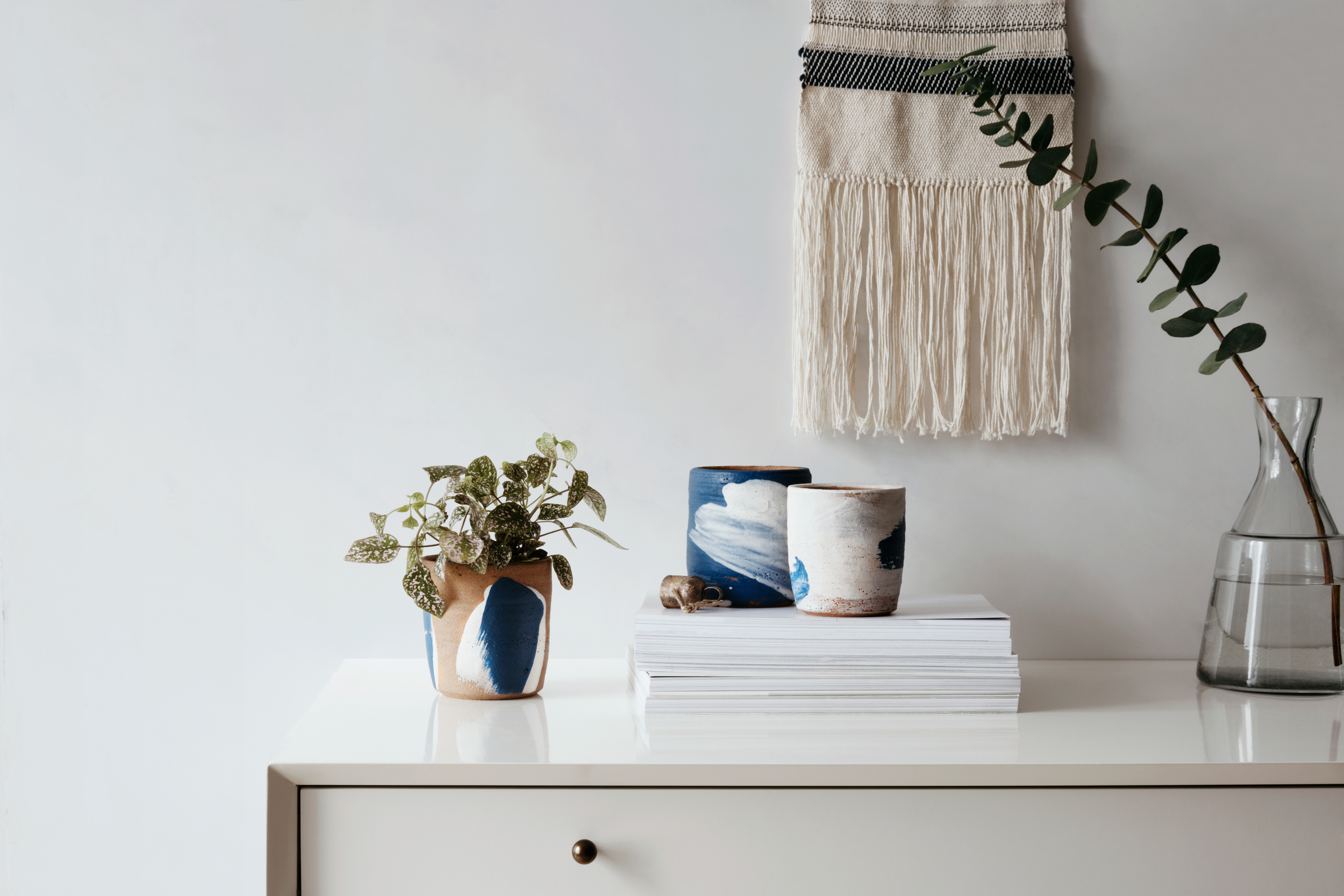
Taking the seemingly ordinary and crafting it into an extraordinary work of art that will last forever.
2015-08-12_home-goods-0052-v2-FINAL.jpg

Organic Layouts — Tudor Magazine

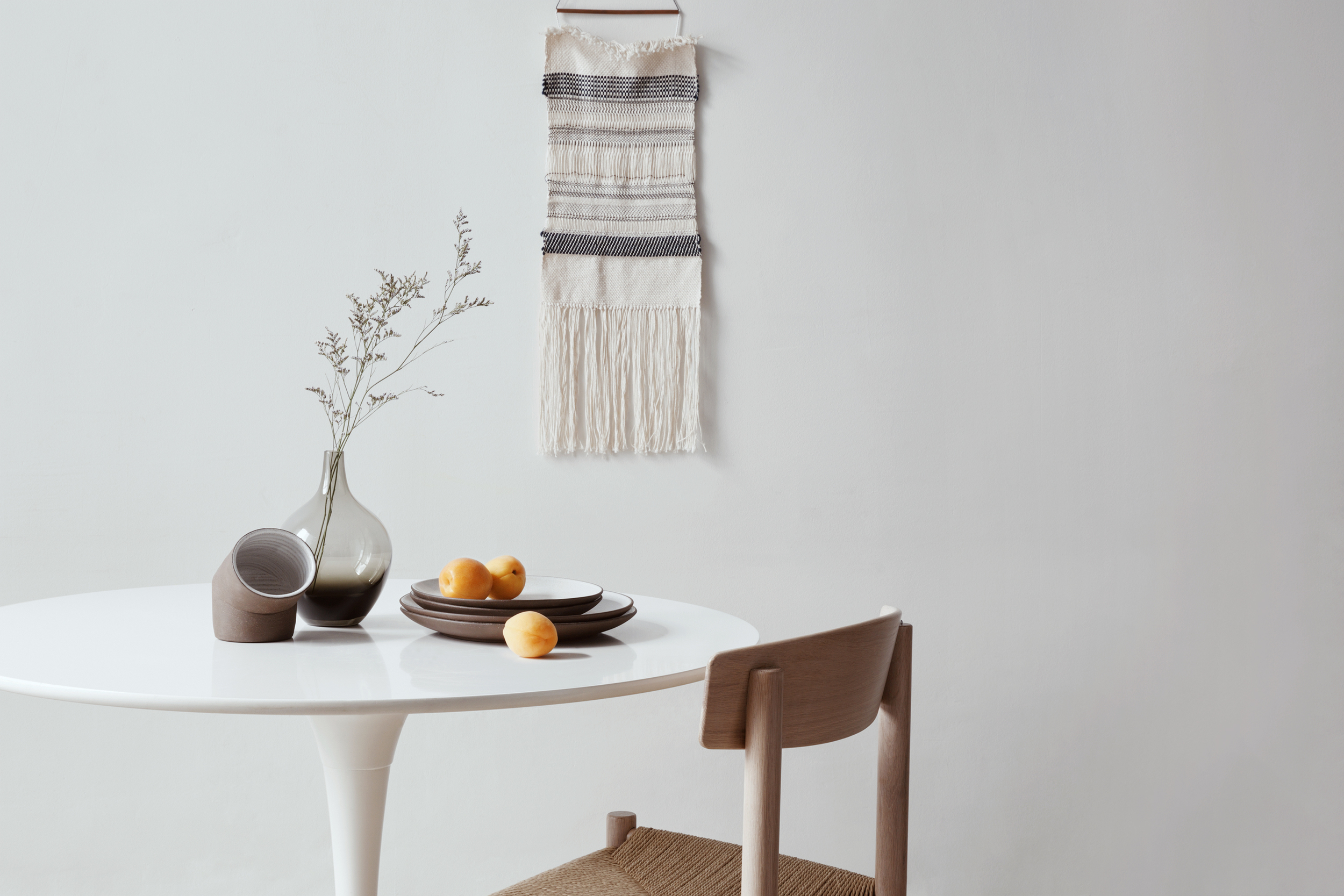
Paris, France. February 2015. An interior design publication was profiling a pottery studio called Clay. Photography Assistant: Ingrid Li. Prop Stylist: Quentin Berger.
2015-08-12_home-goods-0052-v2-FINAL.jpg
2015-08-12_home-goods-0060-FINAL.jpg
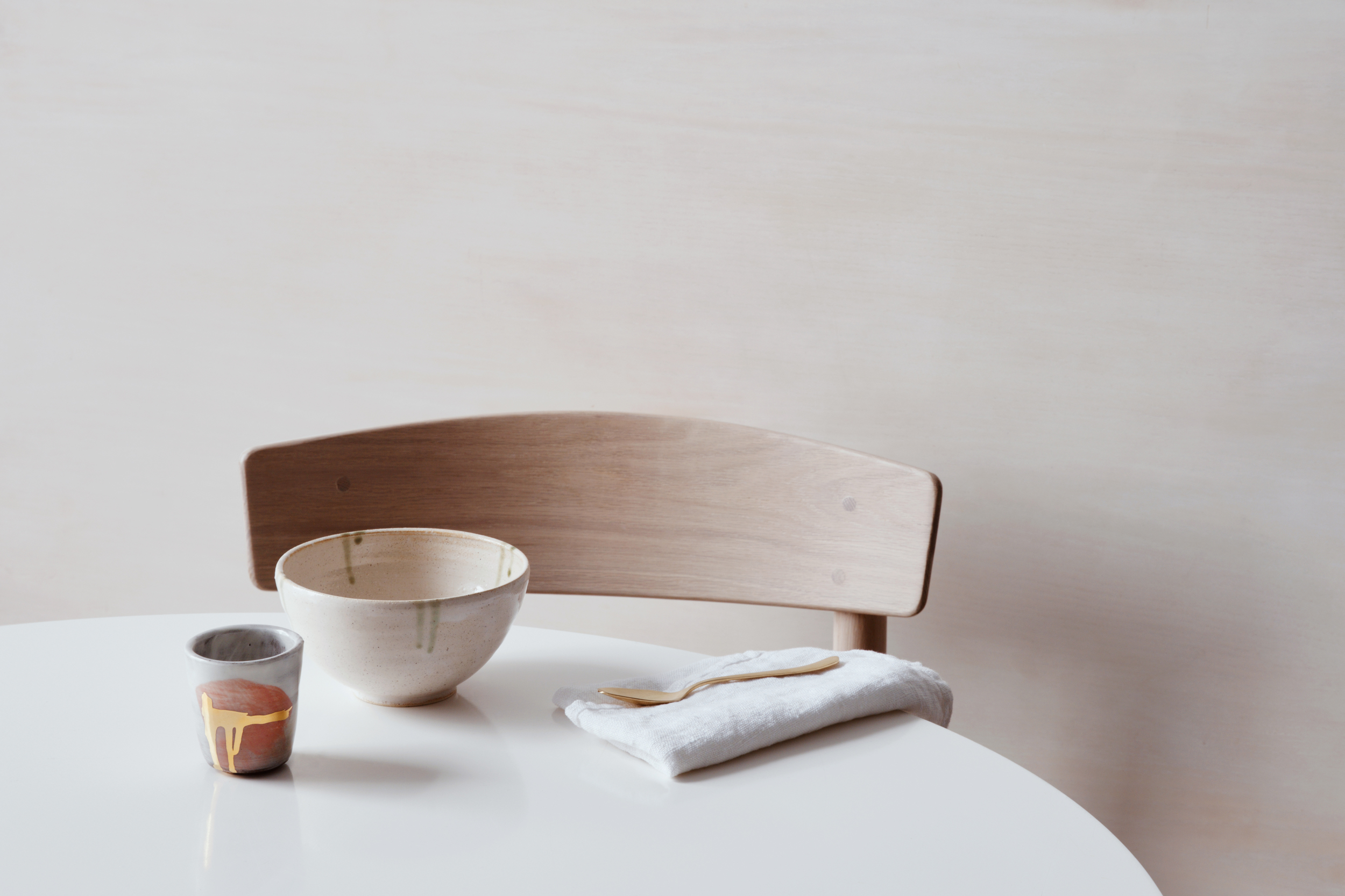
 We juxtaposed the minimal layout of Clay’s studio with their pottery design using natural lighting and a wide-angle lens.
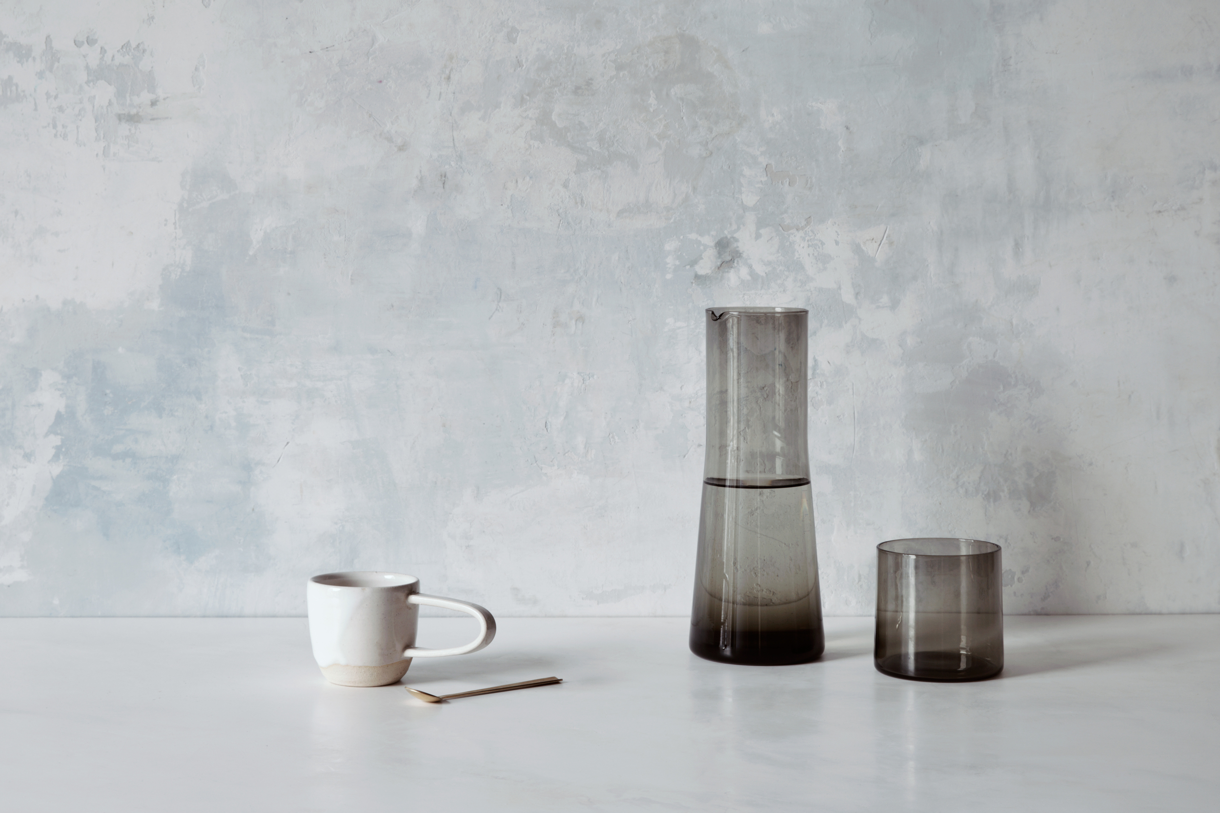
We juxtaposed the minimal layout of Clay’s studio with their pottery design using natural lighting and a wide-angle lens.
2015-08-13_home-goods-0145-FINAL.jpg
2015-08-12_home-goods-0115-FINAL.jpg
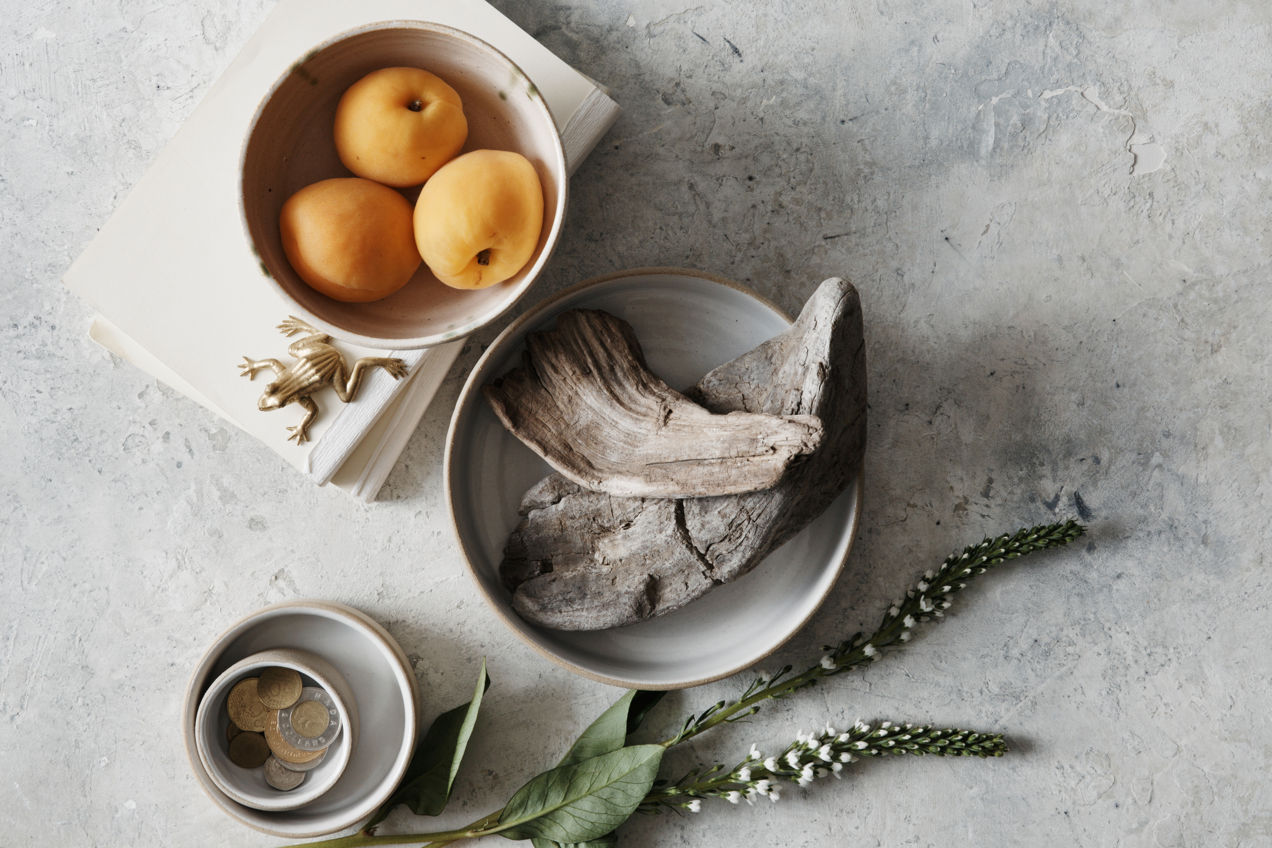
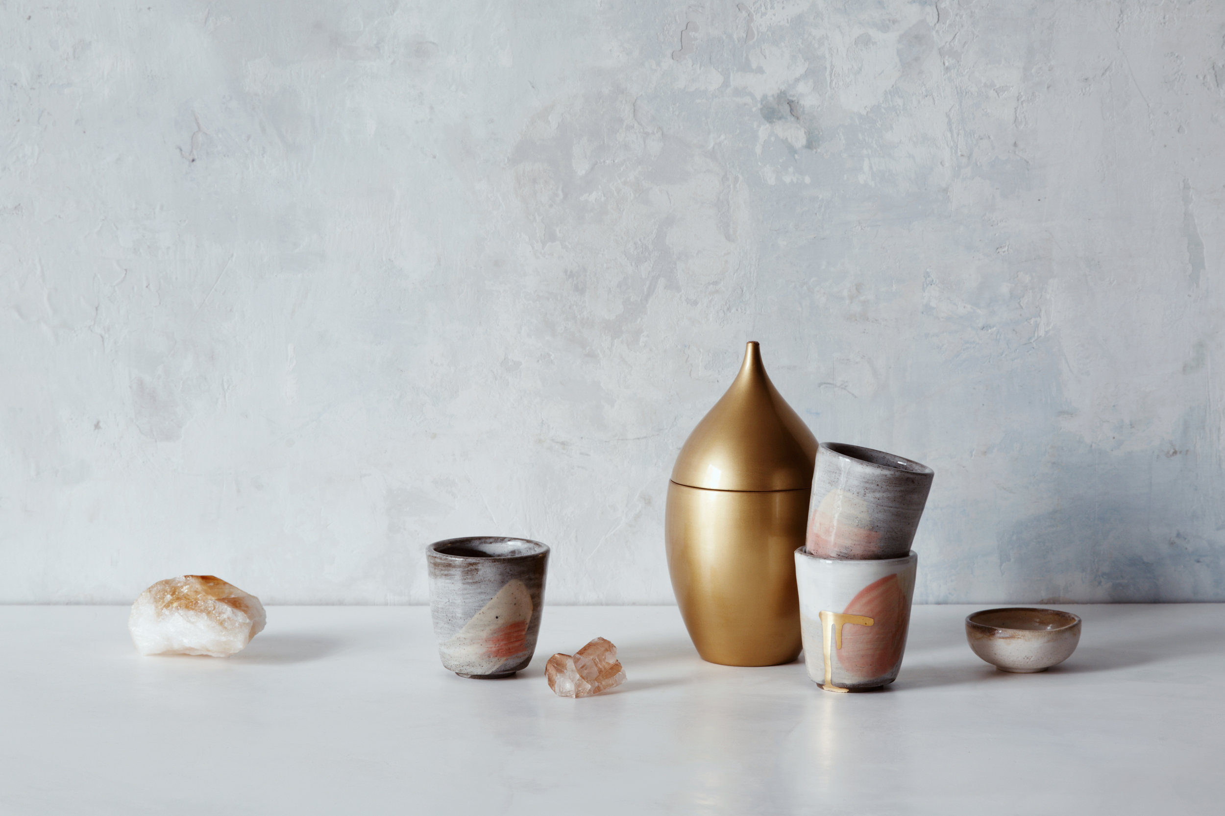
 Clay’s studio had very neutral tones. We wanted to maintain that feel and were careful about placing earthy textures with subdued, complimentary colors.
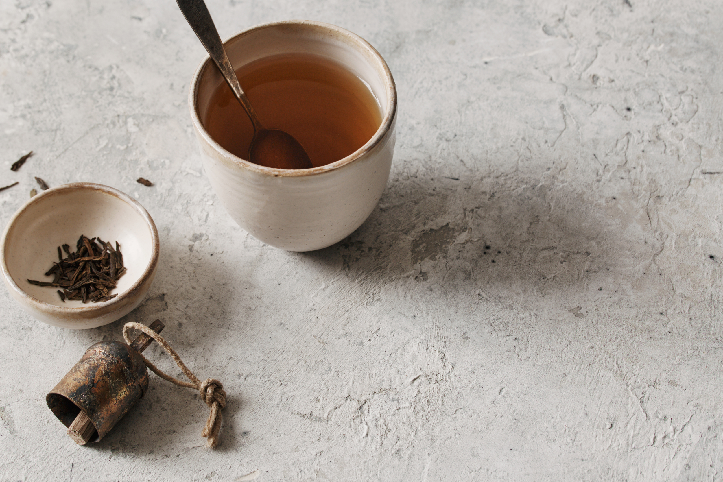
Clay’s studio had very neutral tones. We wanted to maintain that feel and were careful about placing earthy textures with subdued, complimentary colors.

2015-08-13_home-goods-0158-FINAL.jpg
2015-08-13_home-goods-0141-FINAL.jpg